
Exciting news! We’re introducing new illustrations to help us better communicate in a clear, approachable way.
Last year, our team ran research to evaluate the effectiveness of our old, fish-themed style. We loved the fish (and still do!) but it became clear that there was a mismatch between the perception of those fish illustrations and how we hoped people would view Humu.
In other words, while our old style was playful and fun, it didn’t do the best job of explaining the complex world of human behavior at work—which is what we’re all about.
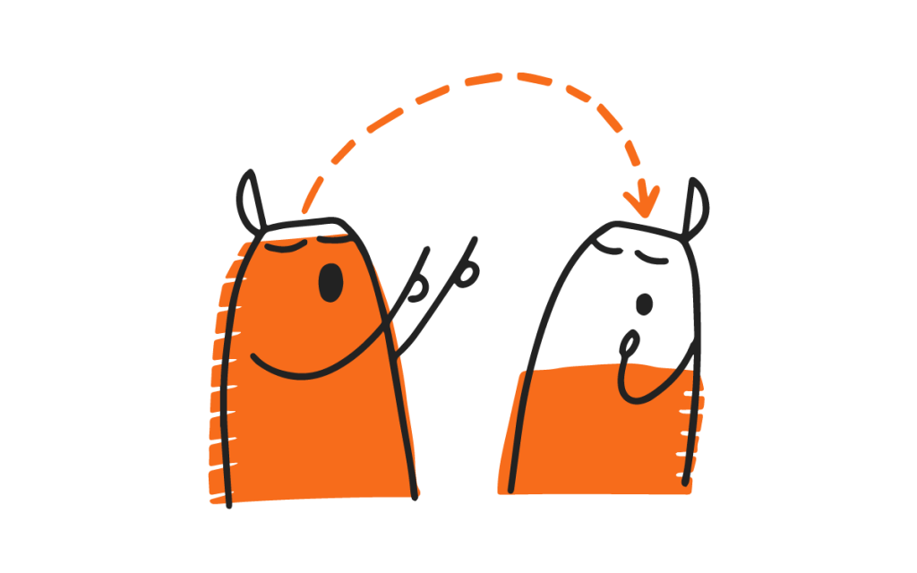
The new illustrations, like Humu’s nudges, help people better understand the science of how to make work better. It’s a great match for our mission.
Here are some things you’ll notice about our new style:
Science with personality
Our new illustrations are designed to feel like they could have been drawn by a scientist. Think loose, imperfect diagrams sketched excitedly on a whiteboard or even scribbled on a napkin, intended to help illustrate a tricky concept.
In fact, while developing the new style, we pictured a behavioral scientist enthusiastically giving their non-scientist friend advice about how to navigate a tough work situation, and occasionally pausing to draw figures on a Post-It note. The scientist first uses a black pen to sketch out the scene, and then comes back with a colorful marker to highlight the takeaway.
That’s why our illustrations are created in two passes: first, a simple black stroke, then, a splash of color and shape.

The designs are simple and straightforward, never frilly or ornamental, to share information while remaining approachable.
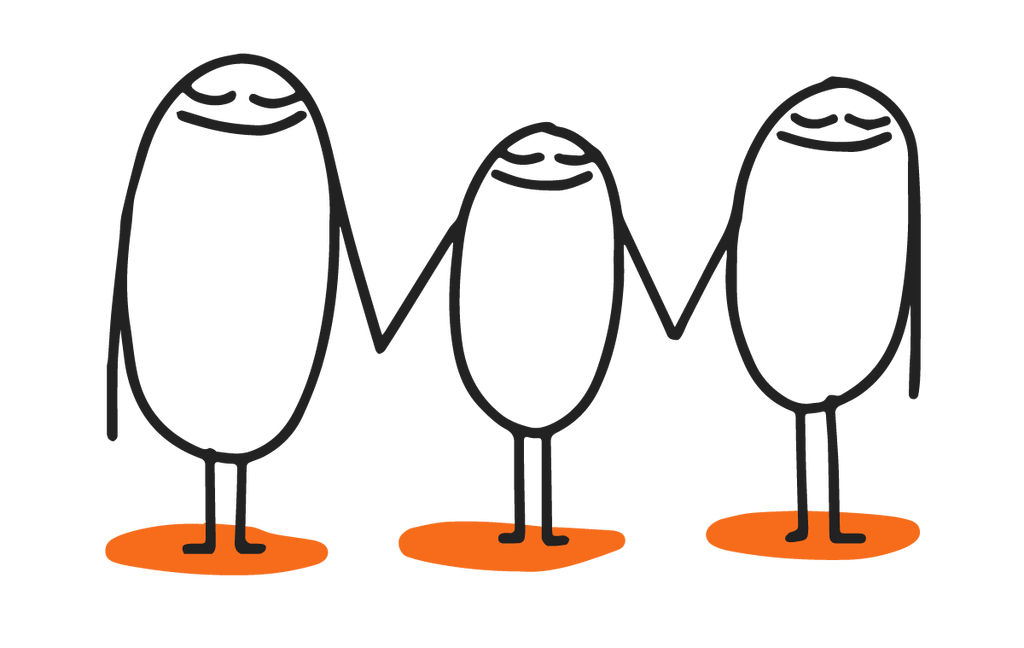
Universally relatable
Our human-like figures are inclusive—intentionally drawn without any details that might imply a specific gender, ethnicity, or other demographic group. We want everyone to be able to see themselves in a given scene.
That’s why in the new style, figures are drawn as loose, circular forms with lines for legs and arms. This lets us represent people in a general, universally relatable way, while still conveying emotion. (Which is easier to read on human-like faces than on fish.)

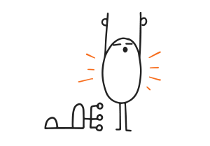
Humu’s previous style: aquatic and abstract
Imperfect, emotive, and flexible
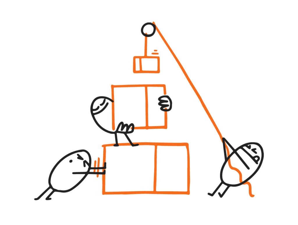
The new illustrations follow three key principles: they’re imperfect, emotive, and flexible.
Humans are imperfect, and our new illustrations reflect that. This comes from one of Humu’s major design principles, meeting people where they are to help them make the small changes that matter most.
At the same time, they’re emotive, both evoking a feeling and supporting the tone of the nudge they’re accompanying.
Finally, they’re flexible. The style can effectively convey a bunch of human scenarios—like teamwork or personal reflection—but also flex to illustrate charts, objects, and notes in a similar style.
Tactically, we wanted a style that’d be reproducible across the thousands of nudges we deliver, while still being recognizably “Humu.”
The end result highlights Humu’s scientific-but-human approach to changing behavior by making abstract concepts seem more relatable —and behavior change more possible.
Look for the new Humu illustrations in our nudges, blog, and more beginning this week. We hope you love the updated illustrations as much as we do!


.png)
